
Theming
Choose from a variety of themes or develop your own theme easily.
Architecture
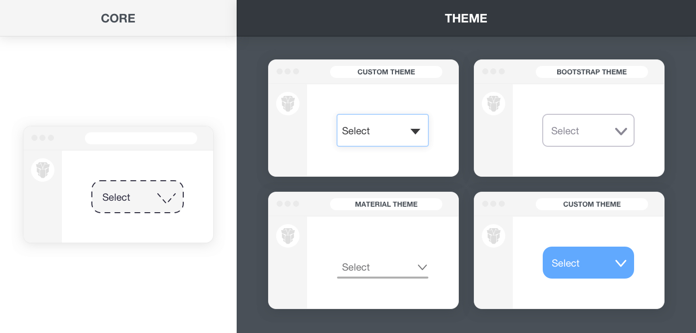
PrimeReact is a design agnostic library so unlike other UI libraries it does not enforce a certain styling such as material or bootstrap. In order to achieve this, styling has been separated into two parts, core and theme. Core resides inside PrimeReact to implement the structure of the components such as positioning whereas theme brings the colors, paddings and margins. vVarious free themes and premium themes are available along with premium templates that provide an application layout as well. All the free themes are built with the Theme Designer and the npm package brings the compiled CSS output of the theme whereas SCSS is kept as a premium feature in the designer.
Free Themes
PrimeReact ships with various free themes to choose from. The list below states all the available themes in the npm distribution with import paths.
primereact/resources/themes/bootstrap4-light-blue/theme.css
primereact/resources/themes/bootstrap4-light-purple/theme.css
primereact/resources/themes/bootstrap4-dark-blue/theme.css
primereact/resources/themes/bootstrap4-dark-purple/theme.css
primereact/resources/themes/md-light-indigo/theme.css
primereact/resources/themes/md-light-deeppurple/theme.css
primereact/resources/themes/md-dark-indigo/theme.css
primereact/resources/themes/md-dark-deeppurple/theme.css
primereact/resources/themes/mdc-light-indigo/theme.css
primereact/resources/themes/mdc-light-deeppurple/theme.css
primereact/resources/themes/mdc-dark-indigo/theme.css
primereact/resources/themes/mdc-dark-deeppurple/theme.css
primereact/resources/themes/fluent-light/theme.css
primereact/resources/themes/lara-light-blue/theme.css
primereact/resources/themes/lara-light-indigo/theme.css
primereact/resources/themes/lara-light-purple/theme.css
primereact/resources/themes/lara-light-teal/theme.css
primereact/resources/themes/lara-dark-blue/theme.css
primereact/resources/themes/lara-dark-indigo/theme.css
primereact/resources/themes/lara-dark-purple/theme.css
primereact/resources/themes/lara-dark-teal/theme.css
primereact/resources/themes/saga-blue/theme.css
primereact/resources/themes/saga-green/theme.css
primereact/resources/themes/saga-orange/theme.css
primereact/resources/themes/saga-purple/theme.css
primereact/resources/themes/vela-blue/theme.css
primereact/resources/themes/vela-green/theme.css
primereact/resources/themes/vela-orange/theme.css
primereact/resources/themes/vela-purple/theme.css
primereact/resources/themes/arya-blue/theme.css
primereact/resources/themes/arya-green/theme.css
primereact/resources/themes/arya-orange/theme.css
primereact/resources/themes/arya-purple/theme.css
primereact/resources/themes/nova/theme.css
primereact/resources/themes/nova-alt/theme.css
primereact/resources/themes/nova-accent/theme.css
primereact/resources/themes/luna-amber/theme.css
primereact/resources/themes/luna-blue/theme.css
primereact/resources/themes/luna-green/theme.css
primereact/resources/themes/luna-pink/theme.css
primereact/resources/themes/rhea/theme.css
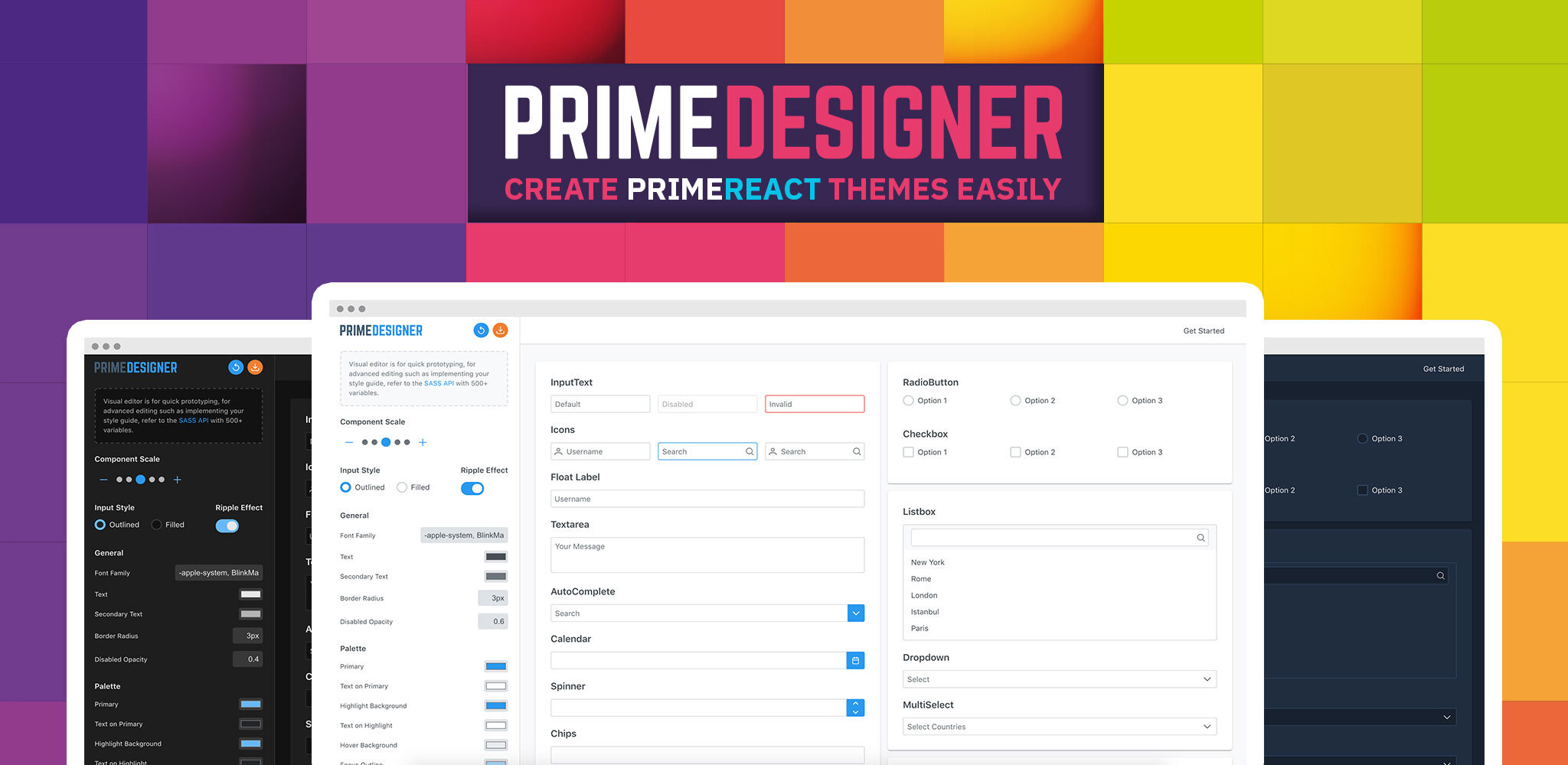
Designer
CSS of the themes share the same license as PrimeReact which is MIT, this means the generated CSS can be customized per your needs however this should be avoided if your customizations are not simple. For instance even to change a primary color, since there is no variable a find and replace should be performed various times. On the other hand, this can be achieved by changing a single variable e.g. $primaryColor. Visit the SASS API for the documentation of available customization options.
Designer is the ultimate tool to create your own PrimeReact experience powered by a SASS based theme engine with 500+ variables and a Visual Designer. PrimeReact only ships the generated CSS of Material, Bootstrap, Tailwind and PrimeOne themes whereas Designer provides full access to the whole SASS structure and the variables of these pre-built themes for easier customization. In addition, designer provides exclusive premium themes to subscribers including Soho, Viva, Mira and Nano that are not available in core PrimeReact distribution at NPM.
Whether you have your own style guide or just need a custom theme, Designer is the right tool to design and bring them to existence.
Visit Designer Website for more information and live demos.
Scoped Styling
Designer themes apply a global skin to the library, in case you need to change the style of a particular component, you may use a named class, CSS Modules or a CSS-in-JS solution like styled-jsx. A video tutorial that goes through the alternatives below is available.
Named Class
A named class is bound to the className prop of a component and the CSS is included with an import. Note that, the css still is still bundled globally so prefer this approach if your application doesn't have a built-in solution to do CSS scoping.
custompanel.css
.mypanel .p-panel-header {
    background-color: #07c4e8;
    color: #ffffff;
}
Then use mypanel class as the className of your panel.
import React from 'react';
import { Panel } from 'primereact/panel';
import './custompanel.css';

export default function PanelDemo() {
    return (
        <Panel header="Named ClassName" className="mypanel">
            <p>Lorem ipsum dolor sit amet, consectetur adipiscing elit, sed do eiusmod tempor incididunt ut labore et dolore magna aliqua.
                Ut enim ad minim veniam, quis nostrud exercitation ullamco laboris nisi ut aliquip ex ea commodo consequat.
                Duis aute irure dolor in reprehenderit in voluptate velit esse cillum dolore eu fugiat nulla pariatur. Excepteur sint occaecat
                cupidatat non proident, sunt in culpa qui officia deserunt mollit anim id est laborum.</p>
        </Panel>
    )
}
Lorem ipsum dolor sit amet, consectetur adipiscing elit, sed do eiusmod tempor incididunt ut labore et dolore magna aliqua. Ut enim ad minim veniam, quis nostrud exercitation ullamco laboris nisi ut aliquip ex ea commodo consequat. Duis aute irure dolor in reprehenderit in voluptate velit esse cillum dolore eu fugiat nulla pariatur. Excepteur sint occaecat cupidatat non proident, sunt in culpa qui officia deserunt mollit anim id est laborum.
CSS Modules
CSS modules allow importing a css file to your react component and refer the classes inside using a variable. Unfortunately CSS modules do not support cascaded classes to be applied to external components however attribute selectors can be used as a common workaround. NextJS has built-in support for CSS modules allowing css files with .module.css suffix to be interpreted as modules.
paneldemo.module.css
.mypanel > [class~="p-panel-header"] {
    background-color: #07c4e8;
    color: #ffffff;
}
import React from 'react';
import { Panel } from 'primereact/panel';
import stylesModule from './paneldemo.module.css';

export default function PanelDemo() {
    return (
        <Panel header="CSS Module" className={stylesModule.mypanel}>
            <p>Lorem ipsum dolor sit amet, consectetur adipiscing elit, sed do eiusmod tempor incididunt ut labore et dolore magna aliqua.
                Ut enim ad minim veniam, quis nostrud exercitation ullamco laboris nisi ut aliquip ex ea commodo consequat.
                Duis aute irure dolor in reprehenderit in voluptate velit esse cillum dolore eu fugiat nulla pariatur. Excepteur sint occaecat
                cupidatat non proident, sunt in culpa qui officia deserunt mollit anim id est laborum.</p>
        </Panel>
    )
}
Lorem ipsum dolor sit amet, consectetur adipiscing elit, sed do eiusmod tempor incididunt ut labore et dolore magna aliqua. Ut enim ad minim veniam, quis nostrud exercitation ullamco laboris nisi ut aliquip ex ea commodo consequat. Duis aute irure dolor in reprehenderit in voluptate velit esse cillum dolore eu fugiat nulla pariatur. Excepteur sint occaecat cupidatat non proident, sunt in culpa qui officia deserunt mollit anim id est laborum.
CSS-in-JS
CSS-in-JS solutions are also popular to implement scoped css, as an example we'll be using styled-jsx to customize our panel. Note that use of :global does not make the styling global and only removes the namespacing from the inner element as it is enough to scope the main container element, in this case .p-panel.
import React from 'react';
import { Panel } from 'primereact/panel';
import css from 'styled-jsx/css';

export default function PanelDemo() {
    const {className, styles} = css.resolve`
        .p-panel > :global(.p-panel-header) {
            background-color: #54b5a6;
            color: #ffffff;
        }
    `;

    return (
        <>
            <style jsx>{styles}</style>
            <Panel header="CSS Module" className={className}>
                <p>Lorem ipsum dolor sit amet, consectetur adipiscing elit, sed do eiusmod tempor incididunt ut labore et dolore magna aliqua.
                Ut enim ad minim veniam, quis nostrud exercitation ullamco laboris nisi ut aliquip ex ea commodo consequat.
                Duis aute irure dolor in reprehenderit in voluptate velit esse cillum dolore eu fugiat nulla pariatur. Excepteur sint occaecat
                cupidatat non proident, sunt in culpa qui officia deserunt mollit anim id est laborum.</p>
            </Panel>
        </>
    )
}
Lorem ipsum dolor sit amet, consectetur adipiscing elit, sed do eiusmod tempor incididunt ut labore et dolore magna aliqua. Ut enim ad minim veniam, quis nostrud exercitation ullamco laboris nisi ut aliquip ex ea commodo consequat. Duis aute irure dolor in reprehenderit in voluptate velit esse cillum dolore eu fugiat nulla pariatur. Excepteur sint occaecat cupidatat non proident, sunt in culpa qui officia deserunt mollit anim id est laborum.
Scaling
PrimeReact utilizes rem units to make sure the components blend in with the rest of your UI perfectly. This also enables scaling, for example changing the size of the components is easy as configuring the font size of your document. Code below sets the scale of the components based on 16px. If you reqire bigger or smaller components, just change this variable and components will scale accordingly.
html {
    font-size: 16px;
}
Some commonly used components such as inputs, buttons and datatable also provide per component scaling with special classes. Components with specific scaling options are documented in their own documentation.
<InputText type="text" className="p-inputtext-sm" />;
<Button label="Button" className="p-button-lg" />;
PrimeFlex CSS
PrimeFlex is a lightweight responsive CSS utility library to accompany Prime UI libraries and static webpages as well. PrimeReact can be used with any CSS utility library like bootstrap and tailwind however PrimeFlex has benefits like integration with PrimeReact themes usign CSS variables so that colors classes e.g. bg-blue-500 receive the color code from the PrimeReact theme being used. PrimeReact follows the CSS utility approach of PrimeFlex and currently does not provide an extended style property like sx. Same approach is also utilized in PrimeBlocks for PrimeReact project as well.
Here is an example to demonstrate how to align 3 buttons horizontally on bigger screens and display them as stacked on smaller ones.
<div className="flex flex-column md:flex-row justify-content-between my-5">
    <Button type="button" label="Button 1" className="mb-3 md:mb-0"></Button>
    <Button type="button" label="Button 2" className="p-button-secondary mb-3 md:mb-0"></Button>
    <Button type="button" label="Button 3" className="p-button-help"></Button>
</div>
In addition to PrimeFlex, PrimeReact has a couple of css utility classes on its own as well.
| Name | Description |
|---|---|
| p-component | Applies component theming such as font-family and font-size to an element. |
| p-fluid | Applies 100% width to all descendant components. |
| p-disabled | Applies an opacity to display as disabled. |
| p-sr-only | Element becomes visually hidden however accessibility is still available. |
| p-reset | Resets the browsers defaults. |
| p-link | Renders a button as a link. |
| p-error | Indicates an error text. |
| p-invalid | Applies the invalid style to a text or a form field. |
| p-text-secondary | Applies the text color of the theme with the secondary priority. |
CSS Variables
Each PrimeReact theme exports numerous CSS variables, refer to Colors page for more details.
Component Scale
Input Style
Ripple Effect
Free Themes
Built-in component themes created by the PrimeReact Theme Designer.
Bootstrap
Material Design
Material Design Compact
Tailwind
Fluent UI
PrimeOne Design - 2022 NEW
PrimeOne Design - 2021
Premium Themes
Premium themes are only available exclusively for PrimeReact Theme Designer subscribers and therefore not included in PrimeReact core.
Legacy Free Themes
Premium Create-React-App Templates
Beautifully crafted premium create-react-app application templates by the PrimeTek design team.


